|

|
|
Chart Types Not Native to Excel.
Microsoft Excel allows users to create many chart types, but people have invented many other chart types which at first glance are not possible in Excel. However, Excel's charting capabilities are extremely flexible. So with a little creativity, and with sometimes heroic formatting measures, it's possible to produce many of these chart types in Excel. Below is a partial list of charts which can in fact be made in Excel.
|
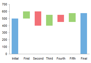
Waterfall charts are a special type of Floating Column Charts. A typical waterfall chart shows how an initial value is increased and decreased by a series of intermediate values, leading to a final value. An invisible column keeps the increases and decreases linked to the heights of the previous columns.
This page shows how to arrange your data and create a waterfall chart in Excel.
Top of Page
|
|
Stacked column charts are commonly used to display proportions of data across different categories. While the height of each stack is proportional to the breakdown of the data in one dimension, standard stacked charts have uniform column widths. A Marimekko chart, also called a matrix chart, enhances a stacked column chart by making the column widths or bar heights proportional to another variable.

This page describes the rearrangement of data required to construct and label a Marimekko chart in Excel.
Top of Page
|
|

Excel offers clustered column charts and stacked column charts among its standard options. How do you combine a stacked column chart with a clustered column chart?
Through careful arrangement of the data in your worksheet, you can make a stacked column chart that looks like a clustered-stacked column chart. In Clustered and Stacked Column and Bar Charts. I show how it is done with illustrated step-by-step instructions.
Top of Page |
|
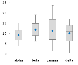
Box and Whisker charts (Box Plots) are commonly used in the display of statistical analyses. Unfortunately, Microsoft Excel does not have a built in Box and Whisker chart type. You can create your own custom Box and Whisker charts, using stacked bar or column charts and error bars, in combination with line or XY scatter chart series to show additional data. The procedures in these tutorials have been updated to show how to add additional series (means of other populations, perhaps, or sets of target values). This page also links to a utility which can be used to generate Box and Whisker charts directly from population data. The Box Plot utility has recently been upgraded to provide more professional output, to correct treatment of outliers in horizontally oriented charts, to run tenfold faster, and to fix a few small bugs. The utility was previously updated to provide additional chart styles, and to correct problems experienced by some non-US users.
Top of Page
|
|
Gantt charts are useful tools in program management, which help to show graphically when tasks must start and finish, and which tasks are underway at any given time. Gantt charts help in scheduling of the many tasks in a program, and in identifying potential resource issues in the schedule. A simple Gantt chart is merely a floating bar chart, that is, a stacked bar chart in which the first series is formatted to be invisible. The second series of bars are stacked on the first, but these bars appear to float in the middle of the chart, because the first series is formatted to be invisible.
This example shows horizontal task bars that are split to show the percent completed, milestone markers at the end of each task bar indicating whether the task has been finished, and one or more vertical lines indicating particular dates along the axis.
Top of Page
|
|
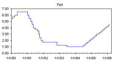
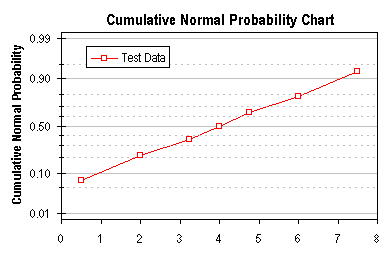
Step charts are useful for showing a quantity which changes intermittently, but remains constant between these changes. Examples of data that benefits from being plotted in a step chart include interest rates vs. time and tax rates vs. income. Excel has no native step chart capability, but this article describes two techniques for manufacturing step charts. The first technique uses an XY chart with custom error bars, while the second uses a line chart with dual overlapping ranges for its source data.
Top of Page
|
|
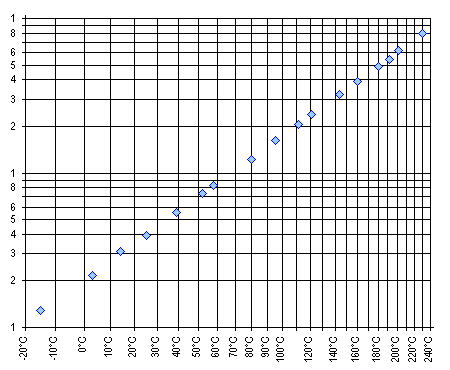
Often when a series of values and corresponding labels is to be plotted, the chart of choice is a bar chart. This is a reasonably straightforward chart, easy to make and fairly clear in its presentation. A "Dot Plot" is a way to chart the same information that is cleaner and according to research more easily understood. The chart still displays labels along a vertical axis, while the data is charted as dots, spaced horizontally according to its value. This page also links to a utility which can be used to generate Dot Plots directly from worksheet data.
Top of Page
|
|
Microsoft Excel does not offer a built in capability to chart probability data, but the technique described here allows you to simulate a probability scale along a chart axis.
Top of Page
|
|
An Arrhenius equation gives the following relationship between some measure of reaction rate or chemical solubility and temperature:
K = A exp (-Q/RT)
where K is the rate or solubility, A is a constant, Q is an activation energy, R is the gas constant, and T is the absolute temperature. The equation above can be restated to:
log (K) = A' - Q/RT
A chart can be constructed with log(K) on the Y axis and reciprocal temperature (1/T) on the X axis; the slope of this line indicates the activation energy (actually -Q/R) and the intercept is the new constant A'. This page describes the construction of one variation of this type of chart.
Top of Page
|
|
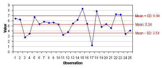
Microsoft Excel does not offer a built in capability to draw lines corresponding to statistical values for a series, such as the mean and the mean ± k standard deviations. The example on this page shows how to add statistical indicators to a simple run chart.
Top of Page
|
|
|