|
Bubble charts are a popular and potentially effective way to add an additional visible dimension to charted data. In addition to locating a marker at a position reflecting values of the X and Y variable, the size of a marker is proportional to a third variable. You could vary colors of the markers to display a fourth dimension, but that's a lesson for another day.
In Microsoft Excel's bubble charts, bubble sizes are fixed according to the largest bubble in the chart. You can fine tune this maximum size by double clicking on any series, and on the Format Series dialog, Options tab, select a default multiplier. I like to use 200% to get large bubbles.
This is a problem when comparing multiple charts that have dissimilar bubble size data. If you use the same bubble size multiplier, the largest bubble in each chart is the same size, despite the difference in bubble size values. This nullifies the entire advantage of a bubble chart over a line or scatter chart: the third variable is no longer reflected accurately.
Data for two bubble charts, identical except for bubble size values.
X |
Y |
Bubble |
2 |
4 |
4 |
3 |
3 |
3 |
4 |
2 |
2 |
5 |
1 |
1 |
|
|
X |
Y |
Bubble |
2 |
4 |
0.4 |
3 |
3 |
0.3 |
4 |
2 |
0.2 |
5 |
1 |
0.1 |
|
Two seemingly identical bubble charts, with very different bubble size values.
Knowing the difference in maximum bubble size between the two charts, you could adjust the bubble size multiplier in the chart with smaller bubbles. But this adjustment is a pain. Besides, it isn't dynamic, so if the data changes, you have to adjust it again.
One complicated solution to this problem is to draw your own circles, sized appropriately for each bubble. Copy and paste each circle onto the appropriate data point in an XY Scatter or Line chart in a technique described in Custom Chart Series Markers, elsewhere on this web site. The result is a highly customized, oppressively interactive chart; of course you could write a VBA procedure to do this for you, as Microsoft describes here: How to Use a Visual Basic Macro to Create a Bubble Chart. (There is a simpler way than this to make a true bubble chart in VBA, which will be covered in a future article.)
The simpler, more elegant trick is to add an additional one-point series to each chart using data such as this. A formula in the third column links the bubble size of this added series to the maximum of all bubble sizes in the real data of the two charts.
The easiest way to add a new series to a chart is to copy the worksheet data, select the chart, and choose Paste Special from the Edit menu. Use the appropriate options to add a New Series, with Series in Columns, and Categories in the first Column.
Since bubble sizes are fixed according to the largest bubble in the chart, the bubbles in both charts are fixed by the added point. The bubbles in both charts are now sized according to the same bubble size scale.
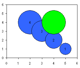
An additional single-point bubble series provides uniform scaling to these charts.
The last step of the process is to hide the added series: double click on it, and on the Format Series dialog, Patterns tab, select none for border and fill.
Two bubble charts, with very different bubble size values, appropriately scaled to reflect the difference.
|