
|
|
|
Speedometer Chart.One style of chart that Microsoft Excel does not offer is alternatively referred to as a Speedometer Chart, a Gauge Chart, or a Dial Chart. It is possible to achieve the desired effect by constructing a combination chart with a Donut Chart series and one or more XY (Scatter) Chart series. Several years ago I built such a chart as a demo of this kind of combination chart, and I posted instructions here; the chart is shown below.
One of the most misunderstood terms in business today is "dashboard". When many people hear the phrase "dashboard report", they think of the dashboard of their car, or even the cockpit of an advanced fighter jet, with fuel gauges, speedometers, and other displays crammed into a tight space. These displays are effective in your car, because they tell you what's going on right now. They're effective in a jet, because the pilot has undergone many hours of training in order to interpret these gauges appropriately. These flashy but cluttered displays are horrible in a business report, because they are inefficient at presenting information, they don't show trends, they distract the viewer with colors and glitter, while presenting very little useful information. A dashboard report is not a set of dial gauges that mimics the cockpit of a 747; rather it is the careful use of a large number of small, well-designed charts to pack a great deal of information into a small area on screen or on a printed page. What makes a speedometer gauge ineffective for a business dashboard? First, a business dashboard typically should include a fairly large number of small charts, each showing many data points which display timeline data leading up to the present time. A dial chart is generally fairly large, two to four times the area of an effective line, column, area, or XY chart which shows one or more series of data. The dial chart typically shows one or two data points, as needles against a backdrop of two or three more points, showing values that may represent acceptable and unacceptable values. So we see that these dials have a very poor data density compared to conventional charts. Another drawback to a dial gauge is that the values are related to the angular orientation of the needles. Experts have shown that human perception is much more effective at determining accurate values if they are plotted as positional or length features in the chart, that is, as points with markers and as bars or columns. This makes dials ineffective; it also explains why their cousins pie and donut charts are also not very good at showing data. Unfortunately people are very familiar with these charts, so they neglect their inability to accurately decode these charts. (In general, don't you find that people are good at neglecting their own inabilities?) Yet another drawback to a speedometer chart is how difficult it is to construct. People have trouble with combination charts in general. The dials are more complex than "regular" combination charts because they require two compeletely different data transformations. The data must be transformed one way to create the dial, the multicolored band around the circumference of the chart. The data must be transformed another way to correctly plot the needles against the band, and the ticks and tick labels around the outer edge of the band. Most questions I've fielded about these charts are from people who didn't grasp the trigonometric and algebraic concepts upon which these data transformations rely. I've decided to remove the speedometer/dial/gauge chart from my web site, because of its ineffectiveness and its complexity. I've written a short description of Effective Dashboards, and provided links to true dashboard resources. |
Peltier Technical Services, Inc.Excel Chart Add-Ins | Training | Charts and Tutorials | PTS BlogPeltier Technical Services, Inc., Copyright © 2017. All rights reserved. |

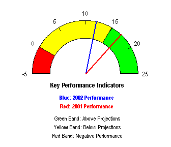 I was astounded by the response to this chart. People in business as well as manufacturing have been talking about "dashboard reports" for some time, and what makes a good dashboard but a few dials, to represent your gas tank, your engine RPMs, your speed, etc. At first it seemed that I'd filled a need in the Excel charting market, but more recently the speedometer chart has troubled me.