|
|
|
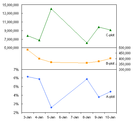
Excel Panel Charts with Different ScalesThe ProblemOn several pages in this web site I've shown how to construct "panel charts", that is, charts which are divided into several parallel panels, each panel showing part of the data in the chart. Stacked Charts With Vertical Separation shows how to present similar sets of data in horizontal panels, offset vertically but aligned over a common category axis. Panel Chart Example: Chart with Vertical Panels shows vertical panels, offset horizontally but sharing the value (Y) axis. Births by Day of the Year shows several years worth of data in separate horizontal panels by year, with a common day-of-the-year axis along the bottom of the chart. In the examples described above, the stacked panels all use the same scale, but the data is offset so one series does not obscure the others. There are many cases, however, where a panel chart is ideal for displaying data with different value ranges, and even in different sized panels. For example, on the business pages you can see stock prices in a large panel of a chart, with share volume or other index shown in a thinner panel below the prices; the panels use the same date axis. Or an engineering display may show a number of parameters in horizontal panels that share a time axis, or perhaps a value axis that displays applied voltage or concentration of a chemical constituent. The DataThe data below is sample data provided by a newsgroup visitor who wanted to know how to plot all of the data on a single chart. Notice the extreme range of magnitude of the data. Column A has single digit percentages, column B has hundreds of thousands, and column C ranges from millions to tens of millions. It is very hard to find a scale to fit all of this data. You could plot two series on primary and secondary axes, then use a trick like Tertiary Y Axis to fake a third scale for the third set of data, but this is not a very good approach. The extra axis takes up a lot of space in the chart, and it's now three times as hard to keep track of which axis scale applies to which data.
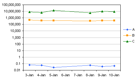
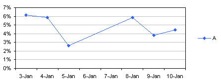
First Attempts at a ChartThe problem with charting this data is shown in our first attempt. Series A hugs the X axis along the bottom of the chart, while series B seems to be a horizontal line not far from this axis. Only series C shows normal, readable variability.
A common remedy is to use a logarithmic value axis. This gets the lower two series up off the horizontal axis, but now all three series are nearly featureless horizontal lines, and there is a lot of unused space in the middle of the chart.
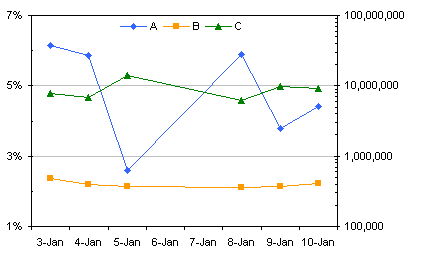
Another approach is to use primary and secondary axes. In the third chart series A is plotted on the primary axis as percentage values, while series B and C are plotted on the secondary axis, on a logarithmic axis scale. It's somewhat better, but the reader still must remember which series goes with which axis.
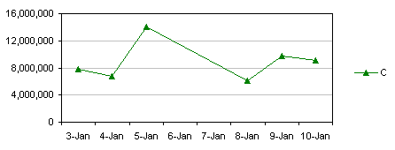
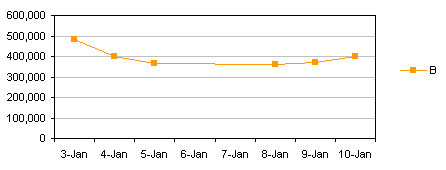
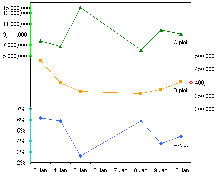
I can make three separate charts, one for each series, and each clearly shows its data. If I could simply align them above each other, perhaps hide the date axis on two of them to remove clutter, it would be a good chart.
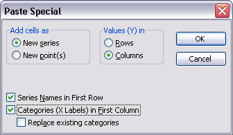
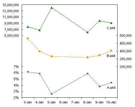
This might work, although it is next to impossible to align the horizontal scales exactly. Notice the margin at the left of these three charts. The chart for series C has a wide margin to accommodate an eight digit number (plus commas), while the chart for series A only requires room for a single digit and the percent sign. You can drag the charts into nearly the right size, but if something changes, you need to readjust everything, and it is a tedious trial-and-error exercise, or a frustrating journey into VBA, where you can usually get within a pixel, but often no closer. For example, if the Series C values jump to 100 million, or series A goes to 10%, or the boss wants to make the charts wider or narrower, it will take some time to recover. The Panel Chart - Additional DataThe table below shows the original data is in A1:D7 (yellow), while the data which will actually be plotted is calculated in E1:G7 (orange); the calculations are described in a moment. Axis scaling data is shown in A9:G11 (blue). The minimum and maximum of the data in columns B through D are shown in rows 9 and 10 below the data for reference. Preferred axis minimum, maximum, and major unit (tick spacing) are entered by the user (or calculated with formulas) in rows 9 through 11 below the data which will actually be plotted. The relative size of each panel is shown in the red cells in row 12: as shown, each panel will be one unit tall, that is, one-third of the height of the whole chart. Using a scheme like this allows the user to change the relative size of one or more panels. With the desired min and max values in E9:G10 and the relative panel sizes in E12:G12, we are ready to calculate our actual plotting values in the orange cells. The formula in cell E2 is =((B2-E$9)/(E$10-E$9)*E$12+SUM($D$12:D$12))/SUM($E$12:$G$12) The (B2-E$9)/(E$10-E$9)*E$12 part of the formula determines the position of the data value in cell B2 within the series A panel, while SUM($D$12:D$12) adds an offset for the bottom of each panel (zero in the case of series A, in the bottom panel), and SUM($E$12:$G$12) scales the panel within the entire chart. This formula is filled into the entire range E2:G7.
The chart uses XY series with data labels on the data points, in place of regular chart axis labels (as shown in numerous examples on this web site). The data for the Y axis scales and Y axis labels of each panel are given in the table below. In general, a "normal" chart doesn't need more than about ten tick labels along an axis, and a panel doesn't need more than about five or six. To be conservative (and to allow for some trial and error), I usually allow enough rows for twice as many ticks as I think I'll need, so I've made this range 12 rows tall, including the headers. If you do need more axis ticks in a panel, you can use more rows. The X-left and X-right data in columns I and J (shown here in green) are the X values for adding axis points on the left axis and the right axis. X-left is the starting date minus 0.5, and X-right is the ending date plus 0.5. You could simply link to cells A2 and A7, or use MIN(A2:A7) and MAX(A2:A7), depending on your data's peculiarities. It is beneficial to alternate sides, with the first panel's axis labels on the left, the second on the right, etc. The axis labels in columns K through M (shown in purple) are calculated based on the preferred axis scale parameters in E9:G11. The formula in cell K2 simply retrieves the minimum for that axis scale: =E$9 This formula is filled into K2:M2. The formula in K3 calculates the next axis label, or puts #N/A in the cell if the axis maximum has already been reached (remember, #N/A is not plotted in a line or XY chart series): =IF(K2+E$11>E$10,NA(),K2+E$11) This formula is filled into K3:M12). Apply the number format to the labels here in columns K through M, so they look the way you want them in the chart. The actual Y values for the axis ticks in columns N through P (shown in aqua) are calculated using a similar formula as above, but calculates the plotted value of the axis label's value. The formula in cell N2 is =((K2-E$9)/(E$10-E$9)*E$12+SUM($D$12:D$12))/SUM($E$12:$G$12) This formula is filled into N2:P12.
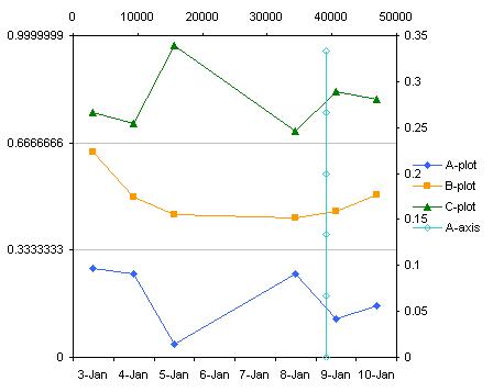
The Panel Chart - ProtocolThe first step of creation of the panel chart shows that we're on the right track. Select A1:A7, then hold CTRL while selecting E1:G7, and create a line chart. Then double click the Y axis, set the scale minimum and maximum to 0 and 1, and the major unit to 0.3333333 (i.e., one-third, for three panels).
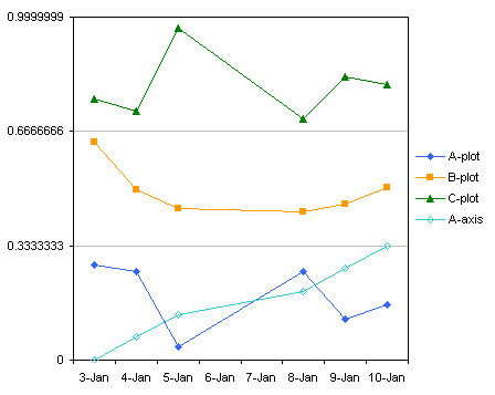
The new axis series is not aligned along the Y axis, because Excel thinks it's another line chart series. Select just this series, go to the Chart menu, choose Chart Type, then select an XY chart type. I've used markers connected by lines to help show the series.
The new XY series is totally misaligned from the line chart series, and it even has its own misaligned secondary X and Y axes. Move the XY series to the primary axis: double click the series, and on the Axis tab, choose Primary.
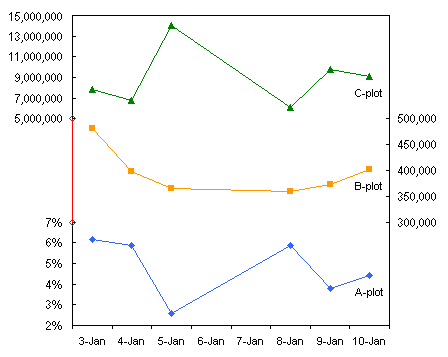
One more quick fix. The X axis has expanded to include one date earlier than before (sometimes it does this and sometimes not). Double click the X axis, and on the Scale tab, change the minimum to the correct date, 1/3/2007.
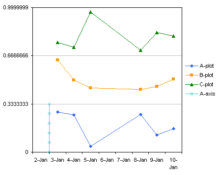
That seems like a lot of work, but with a little practice those last few steps only take a minute. Now add the other two XY series for the axes for the other two panels. Simply repeat the Select-CTRL+Select, Copy, Paste Special operations. Excel remembers that the previous series was added as an XY series on the primary axes, so you don't have to fix the chart after adding each new series.
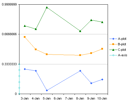
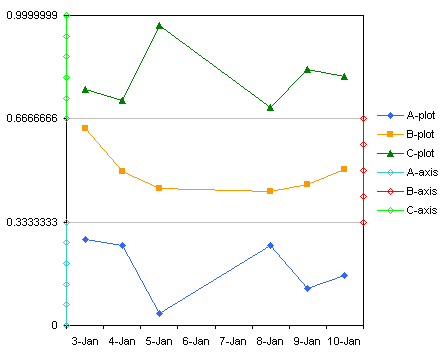
Almost finished. Delete the legend, and change the gridline color to black. Select the last point of series A (two single clicks: one click selects the entire series, the next selects a point). Then double click on the point, or press CTRL+1 (numeral one), to open the Format Point dialog. On the Data Labels tab, choose Series Name, and press OK. Select the last point of series B and press the F4 key to repeat the last action, then repeat for the last point of series C. To position a label, double click on it, and on the Alignment tab, select the desired Label Position; these labels are positioned below their respective points. Reposition one label, then select the next and press F4 to repeat the last action. Finally it's time to add value labels to the vertical axes. You could add labels to each axis series, then manually change the text of each label, but after about the third label this becomes tiresome. Fortunately there are two well-written, easy to install and use, and free utilities that automate this process: Rob Bovey's Chart Labeler, at http://appspro.com, and John Walkenbach's Chart Tools, at http://j-walk.com. Each one allows you to assign the labels in a worksheet range to the points in a chart series, and even link the chart labels, in case the worksheet cells change. Use one of these utilities to assign the three columns of labels (the purple range, columns K through M) to the three axis series (A-axis, B-axis, and C-axis).
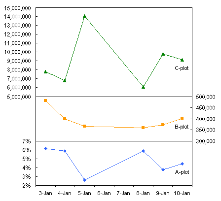
The spacing needs to be adjusted slightly. Resize the plot area to make room for the 15,000,000 label at the top of the left axis, and increase the left margin so the last digit of the long labels do not impinge on the axis.
Hide the axis series, and add tick marks. Double click each series in turn. On the Patterns tab, choose None for line and for markers. Before clicking OK, go to the X Error Bars tab, and add a positive error bar (right-pointing) for series on the left axis or a negative error bar (left-pointing) for series on the right axis, using a fixed value of 0.1. You may want to adjust this value if your chart requires a longer or shorter tick. To make this easier, put the value into a cell in the worksheet, and link to this cell in the Custom (+) or Custom (-) box in the Error Bar dialog. Then format each set of error bars to display the bar style without the crossbar at the end.
Panel Chart with Variable Height PanelsIf you want variable panel heights, we can't use uniformly-spaced gridlines to draw lines between the panels. In this case you would still scale the chart from 0 to 1, use a major unit of 1, and not have gridlines. Instead, calculate where the panels meet, add an XY series of points along one side of the chart, and draw the lines with error bars. The data for these lines is shown in the table below. The X-left values in S1:T1 are the same used above. The Y-divider is calculated using this formula in S2 (which is filled into S2:T2): =SUM($E$12:E$12)/SUM($E$12:$G$12) The error bar length is the end date minus the start date plus 1.
Here is the above chart without horizontal gridlines.
Copy R1:T2, select the chart, and use Paste Special as before, except that the series is now in rows (it was easier to calculate the Y-divider this way).
Hide the new series, and add the horizontal lines. Double click the series. On the Patterns tab, choose None for line and for markers. Before clicking OK, go to the X Error Bars tab, click in the Custom (+) box, and select S3:T3. Then format each set of error bars to display the bar style without the crossbar at the end (though the crossbar is hidden by the plot area border).
The effect of this is shown in the following chart. The relative panel height of the series C panel is changed to 2, while the others remain at 1. All of the formulas update as soon as this value changes, and so does the chart. If you change the number of labels for any of the axis series, you may have to reassign the labels from the worksheet range.
The variations are endless. In the following chart, panels A and C have a relative size of 1 and panel B has a relative size of 0.5. You can have more than three panels, and each panel can be of a completely different size. The only concern is not to let your variations interfere with showing the data in the chart.
|

Peltier Technical Services, Inc.Excel Chart Add-Ins | Training | Charts and Tutorials | PTS BlogPeltier Technical Services, Inc., Copyright © 2017. All rights reserved. |